By Ayah Galal
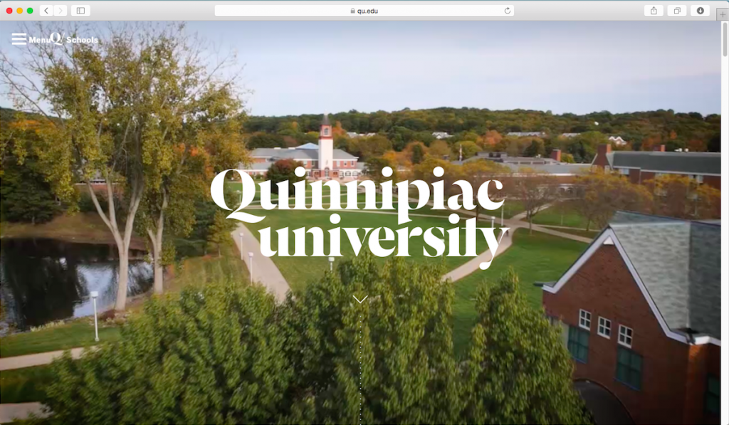
After more than two years of planning, research and design, Quinnipiac University launched its “next generation” website on Friday.
The updated website includes a completely different layout which features new photos, videos and virtual tours.
“I think it’s very aesthetically pleasing and all the updated pictures are very cool so it’s nice to see our classmates in all the pictures,” Andrew Geller, a senior nursing major said.
Geller also likes that the new website domain is www.qu.edu. whereas the previous domain was www.quinnipiac.edu. He thinks it’s more helpful for prospective students and others who might not know how to pronounce or spell out Quinnipiac.
One of the new features includes Quinnipiac Now, a digital publication that provides a live look into the University at any given moment. Students and faculty can also submit their own pictures and stories to be considered for the publication.
The university and its digital marketing agency partners wanted to differentiate Quinnipiac from other university websites, while also meeting the needs of prospective students.
“The new website promises to be one of the most advanced higher education websites built to date,” Keith Rhodes, Vice President of Brand Strategy and Integrated Communications said in a statement on MyQ. “From the outset, the university sought to challenge higher education industry conventions by building a web experience that moves from an institution-first approach to an audience-centric model to better meets the needs of prospective students.”
The Office of Brand Strategy and Integrated Communications focused on creating a user-centric website that focuses on prospective students. However, some students disapprove of the amount of emphasis placed on potential students.
“The tone is extremely recruitment heavy,” Brett Segelman, a senior marketing major said. “Our site now feels like a big fat sales pitch.”
Segelman believes the new website ignores students already enrolled at Quinnipiac, as well as alumni. However, Rhodes is confident in the advancements and innovations of the new site.
Other advancements include a fully responsive design that works across all mobile devices and form factors. The website’s user experience design inspiration was taken from brands like Nike, Apple and Uber.
“This university is not a new Apple product. The attitude of its promotion should have a tone of seriousness and academic excellence,” Segelman added. “The website scrolls like I’m exploring features of the latest iPhone—this is an institution of higher learning, and our promotional efforts need to reflect that truth.”
Following more than two years of planning, @QuinnipiacU launched its new website, https://t.co/PelfuZhTEr What are your thoughts?
— Q30 News (@Q30News) November 6, 2016
According to Q30 News poll on Twitter, 42% of people thought the website is “okay” and 30% of people “loved it.” Thirteen percent said they “hated it” and 15% said they were “not a fan.”


