Quinnipiac’s website gets a new look
December 14, 2020
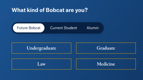
There have been many changes within the Quinnipiac community in 2020, and another update is on its way. The university’s official website, QU.edu, now has a new look.
After many months of designing and testing, the website is ready to launch. According to James Ryan, who is the associate vice president of integrated marketing communications at Quinnipiac University, says it was constructed and organized based on feedback from Quinnipiac staff and students.
“From the beginning of this project our goal was to partner very closely with the university community and that included students, faculty, staff, and alumni,” Ryan said.
With the help of one-on-one interviews, focus groups, and surveys, 1,300 people were behind the new look for the site.
“We had a lot of engagement and input from folks along the way,” Ryan said. “That was to make sure that when we started building the website, we had a foundational understanding of what the university needs were from the website.”
Whether it be current students, parents or guardians, prospective students, alumni, faculty and staff, the unique design is built for the needs of the entire Quinnipiac community.

What’s new to the website:
- The website now has 1,350 pages, 3x the pages it had in the past.
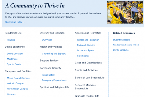
- A mega menu that will expand with related information that is associated with various sections of the website.
- More intuitive way that information is grouped, in order to locate things easier.

The new modernized website will make it a lot easier for individuals to find information at a much quicker rate than in the past.


